BCN Type in progress
I know, you’re wondering whether this has turned into a site about type after last weeks Barcelona font post. But this one I couldn’t resist.
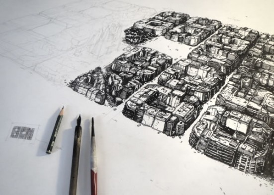
From the hand of German born, but Spanish influenced, Simón Prades, comes BCN Type. Grungy, futuristic lettering inspired by Barcelona’s famous grid system.
Simon says about the project:
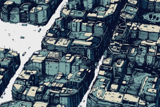
I wanted to combine 3 things I really love in this project: architectural drawing, typography and the city of Barcelona (which is the hometown of my ancestors). The grid of the quarter around Sagrada Família consist of square blocks, which are very similar in height and size and represent the architecture of the city very good in my opinion. I like the idea, that each block is filled with hundreds of very different lifes and opinions, but looks so calm and similar from above.
I love it! The detail in each block is incredible.

BCN Type in detail
Check out this short 45 second video that shows some of the detail close-up.
And see all the illustrations and images of the work in progress on the BCN Type page on Behance.
Great isn’t it?

BCN Type animation


What do you think? Leave a comment